Interpreting Moving Averages in the Wealth Phase Charts
Question:
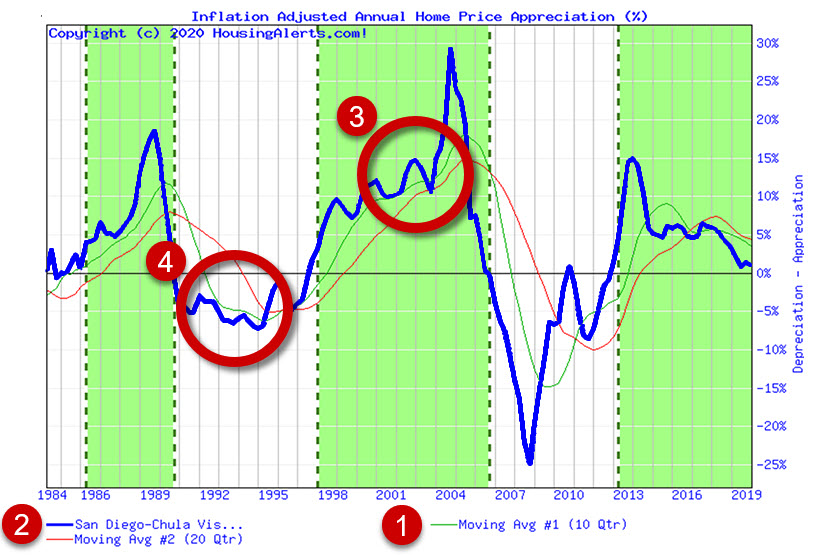
In the wealth phase chart, which line represents the slow moving average and the which represents the fast moving average? Does the fast moving average line signal about a year ahead?
Answer:
The MA (Moving Average) lines individually do not have any particular time period attached to them but depending on where/how you're using the green line, it can have longer or shorter time horizon implications.
For example, one of the ways we use the (1) Green MA line is in helping to calculate one of the short-term STAR momentum indicators. We look to see if the (2) Blue chart line is (3) above or (4) below the Green (fast) MA line. The short-term indicator has a ballpark time horizon of, say, a few quarters at most.
The MA itself doesn't really translate into a time period "prediction'.' Further, because the blue line can bounce around a lot, you shouldn't put much significance in the short-term STAR indicators OTHER THAN ... if a trend were to reverse direction, it HAS to start with the short term indictors!
Think of a change in color for the short term STAR indicators as a wake-up call to pay closer attention, If the reversal is more than random volatility it will work its way into the intermediate STAR indicators.
The role of the green (fast) MA for "intermediate" time periods (generally a year or so) is whether or not the Green MA line is pointing up or down (i.e.. - does it have a positive or negative slope)?
The role of the Green MA line in helping to determine the long-term STAR indicators (up to 2 years or so) relates to how the green line looks RELATIVE to the Slow (red) MA line. Is it above it or below it?
Of course, the STAR indicators take much more into account than just the Green MA line, but that's one way to look at time horizons vis-à-vis the Green (fast) MA line.